(A.K.A.: performance matters)
I went to school for websites back in ‘00, ‘03, when everything was made of tables and spacer.gif, and you had to keep your entire website under 150kb or you failed your class. So gather ‘round, children, and listen to the questionable wisdom of a woman who has refused to touch any sort of HTML since the advent of responsive design.
(I am not an expert.)
What’s this rambling about?
We’re going to be covering a few assorted topics:
- Why nuking your visitors’ mobile data is bad
- How to check if your website is too heavy
- What to do about it
- image-side
- HTML-side
It’s not super complicated, but I really like run-on sentences and sound very condescending.
Why is file size so important?
Heavier images are slower to load, and your visitors might find themselves staring at your art gallery, waiting for each picture to load. Slooooowly. Sloooowly. Line by line. Some of those visitors have ADHD (I am referring to nobody in particular and especially not me). They’re gone.
More importantly, mobile data comes in various package sizes, and some people have less than 1gb/month. Throwing 100mb of images at them on a single page is downright cruel.
Did I sin? Are my images too heavy?
There are quite a few good tools that will analyze a page and tell you everything wrong with it. Today, we are going to use PageSpeed Insights.
Grab your site URL (preferably the page with the most images) and throw it into the form. Submit. Get a cup of tea. Come back to a soul-crushing report that gives you:
- Scores (for mobile and desktop)
- Acronyms
- Judgement
- A laundry list of recommendations
Now search the report for the words “Avoid enormous network payloads”. If you don’t find it, you did good :3
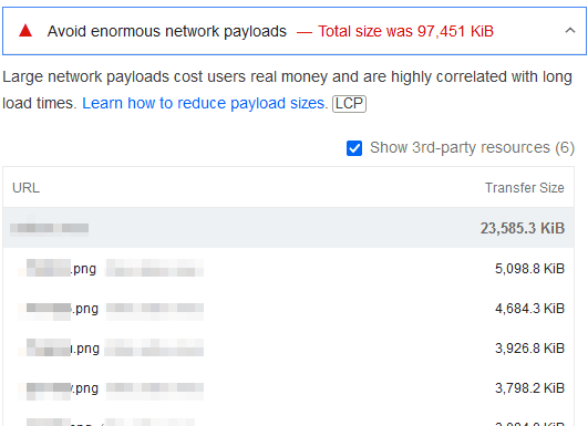
For illustrative purposes, I fed PageSpeed Insights the "gallery" page of a random website. Not naming names. Maybe it was you.
"Total size was 97,471 KiB" is, uh, not good. There's a few reasons something like this can happen, but here it's a simple issue: the gallery is squishing down each artwork rather than using smaller thumbnails, and each picture is quite heavy.
How to fix it?
Smol images
We are going to take the “Peter Pan” approach to things growing too much:
The boys on the island vary, of course, in numbers, according as they get killed and so on; and when they seem to be growing up, which is against the rules, Peter thins them out; (…)
There are various ways to make images “thinner”:
Using adequate dimensions
Determine the largest width/height the image will be displayed at on your page. If your layout is 1200px wide, resize larger images to match that size it in an external editor. Create small thumbnails and link to the large file if needed.
Some screens have a higher pixel resolution, and need alternate larger pictures to display, we’ll cover that in the HTML part!
Using an adequate file format
We have the oldies:
- JPGs are better for photography, and lossy.
- PNGs are heavy but can have use alpha transparency.
- Indexed PNGs (fixed palette with max. 256 colors) are good for pixel art with flat transparency but no animations.
- GIFs have an indexed palette too, and they handle animation. Good for pixel art and such. Not supposed to be used for TV show sequences, but the internet decided otherwise.
Then we have modern formats:
- WebP
- AVIF: open file format and really cool but not yet supported by Edge, so we’ll skip it until Microsoft gets its s*** together.

♫ Everything you the old formats can do, I WebP can do better. ♫
Or, at least, WebP tries its very best. It offers very good compression, handles animation and transparency … So, unless converting your original image to WebP horribly mangles it (or somehow makes it heavier), use WebP. It’s well supported.
Internet Explorer doesn’t count.
“I am not converting my 24871 images by hand!”
Caesium Image Compressor has you covered!

It has every feature you’ll need to quickly convert all (and by that I mean “most”) of your images to WebP:
- It can load folders recursively and save the compressed images to the same folder
- It has various resize options (percentage, dimensions, fit width or height)
- It can add suffixes to the saved files
Which means you can generate “my-birb_thumbnail.webp”, “my-birb_small.webp” and “my-birb_full.webp” from “my-birb.jpg” within minutes, for 24871 images if necessary.
Other tools
- TinyPNG: Optimize images online
- Website Planet compressor: Alternate optimizer (no Webp)
Fancy HTML
To accommodate the many screen sizes an resolutions out there, there’s responsive images.
The website provides a base image and alternate versions, and some instructions on when to use them. The browser picks the best for the current viewport. Which is why I introduced you to Caesium Image Compressor three paragraphs ago. You’ll need it.
Now brace for confusion, although I’m just going to tell that you that features exist, and that smarter people have written better tutorials.
The “srcset” attribute
The simplest way to handle responsive images. It’s a straightforward way to display the same image, but in different sizes, with the browser picking the best size.
The srcset attribute is used on the image tag:
<img src="birb.webp" srcset="birb.webp, birb-2x.webp 2x">Defining the srcset comes with various degrees of complexity. You
can target:
- the pixel density of the screen, using pixel density descriptors (1x, 2x, 3x), so larger images can be used on devices with a higher resolution.
- the viewport’s width, by providing the width of the images: for an image that is 300px wide, we use the “300w” descriptor. Pixel density impacts this.
- Precise sizes, by adding a “sizes” attribute. It allows for more fine-tuning. You list the various sizes of the image in the
srcsetattribute, and “media conditions”, like the maximal size of the viewport, and the available “slot” width to occupy.
<img
  srcset="birb-400w.jpg 400w, birb-750w.jpg 750w"
  sizes="(max-width: 500px) 400px, 750px"
  src="birb-750w.jpg"
  alt="A bird"
>
The “picture” tag
It can be used when you want:
- a fallback image for older browsers that do not support WebP.
- different images depending on the situation: to change the image orientation, to display cropped pictures on phones so the details are clearer…
Here is an example that does both:
<picture>
  <source media="(max-width: 582px)" srcset="robin-portrait.webp">
  <source media="(min-width: 583px)" srcset="robin-landscape.webp">
  <img src="robin-landscape.jpg" alt="A robin">
</picture>
If you resize your browser window, this robin should switch between a portrait closeup and a landscape picture:

Documentation
As I said earlier, smarter people wrote about this ;)